10 Examples of Mental Models in UX Design
Mental models are an important part of user interface design. They allow users to understand how things work by giving them a mental model that they can follow for each task. This article has given you 10 examples of mental models in UX, including what makes it a mental model and why the model is necessary for successful UI design. Whether you're designing your own website or app or working with someone else on their project, these tips should be helpful when considering how to make your product easy to use by all types of people who may need it.
Wes Hunt
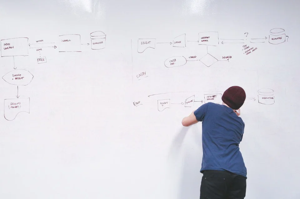
Mental models are people's perceptions and beliefs of how things work. They can be defined as “a simplified, usually conceptual representation of a system, designed to help people understand it and make decisions about their interaction with it." Note, in design mental models affect both users and designers of the system, with a gap between them a primary cause of usability issues. In this blog post, we will discuss several examples of mental models in UI design. We will describe what makes them a mental model, what they represent in the system, why they are important for a successful UI design, and where you can find more information on each one.
We will start with a description of each mental model example and cover why it's a mental model. Unfortunately, mental model examples are cluttered with examples of cognitive biases or mental frameworks as mental models. We hope these mental models in user interface design help you make your own UIs easier to use or understand, as well as learn from others' mistakes!
Mental Model Example #1: The Hamburger Menu
The hamburger menu is one of the most commonly used icons in mobile apps and websites today. It was designed by Norm Cox and originally used in a Xerox Star prototype interface released in 1981. As shown in the screenshot below, it is an icon consisting of three lines or "burger patties" stacked on top of each other. When clicked, it usually opens a sidebar navigation menu from which users can access different parts of the app or website.
The hamburger menu is so popular because it takes up very little space on the screen and can be used to hide a lot of navigation options. It's also easy to spot because of its unique shape and color – as shown in the screenshot below.
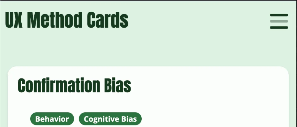
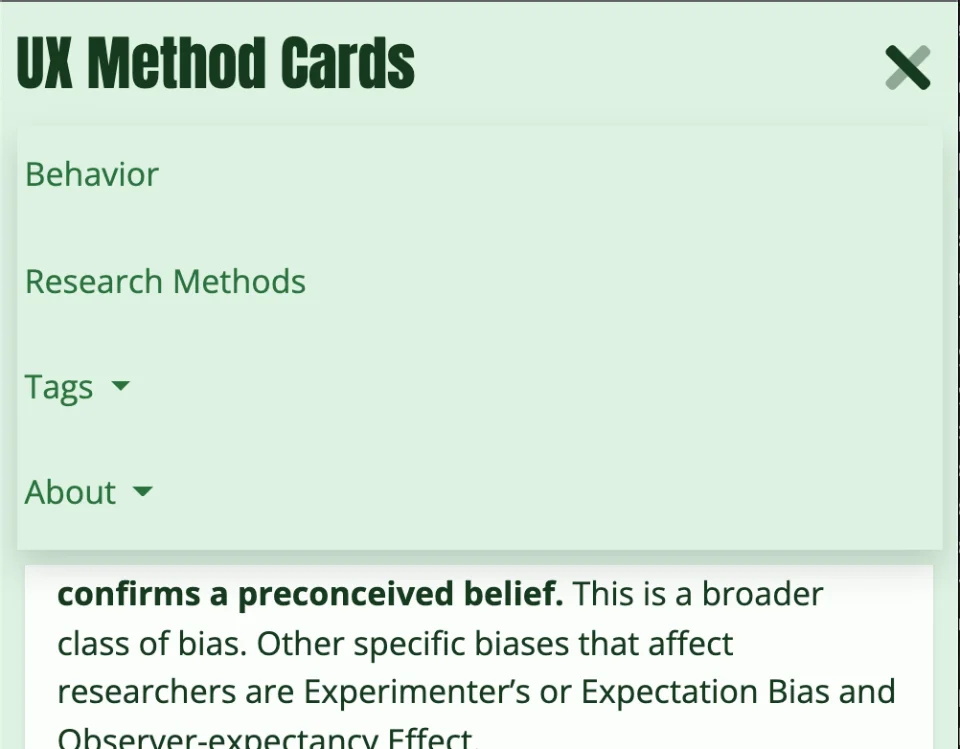
The mental model for this icon is "I need to click this menu to see all the different sections/pages of this website/app". This allows users to understand that the hamburger menu contains all the different navigation options for that particular app or website.
Mental Model Example #2: The Back and Forward Buttons
As shown in the screenshot below, the Back button is an icon in the shape of a left-pointing arrow and the Forward button is an icon in the shape of a right-pointing arrow. They are used to navigate backward and forward through the user's history – either on that website/app or on the web browser itself.
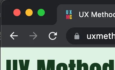
The mental model for this icon is "Left represents backward and Right represents forward". If you think about this, why does a left arrow mean back? Culturally you are probably accustomed to this, but there's no logic behind it. However, embracing this heuristic as a designer allows users to understand that clicking this button will take them one step back in their navigation history.
Mental Model Example #3: The Menu Bar
As shown in the screenshot below, the Menu bar is an area found at the top of most windows-based applications. It contains options for opening files, folders and other applications.
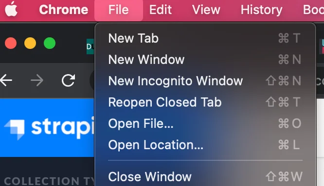
The mental model for this icon is "I need to click this menu in order to see all the different options for this application". This allows users to understand that clicking this menu will give them access to all the different options for that particular application.
Mental Model Example #4: The Navigation Bar & Tabs
As shown in the screenshot below, tabs are used within most windows-based applications (such as web browsers) and they allow users to navigate between different views/screens within an application.

The mental model for these icons is "I can click any one of these buttons to go back or forward through all my previous screens/views without losing what I'm looking at currently". This allows users to understand that clicking any of these buttons will take them back or forward through all the different screens/views that they've previously opened.
Mental Model Example #5: The Search Bar
As shown in the screenshot below, the Search bar is an area found within many applications and websites where users can input text and search for it within the application.

The mental model for this area is usually a magnifying glass icon and an input box for text, "I need to find something I'm not readily seeing currently." This allows users to understand that typing their search term into this box and hitting enter or clicking a button will search for that term within the current application.
Mental Model Example #6: The Help Menu
As shown in the screenshot below, the Help menu is an area found within most applications where users can find help or support for the application.
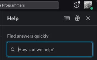
The mental model for this icon is "I need to click this menu to get help with using the application". This allows users to understand that when they are confused and need help that clicking this menu will give them access to options for getting help with using the application (such as by reading instructions, viewing tutorials, or contacting customer support).
Mental Model Example #7: Ecommerce Shopping Carts
Another example of using skeuomorphism to help map users' mental models to an eCommerce system is the shopping cart icon and area. First, it was originally created to match shoppers' mental models to a physical shopping experience.


- A shopper puts an item in a cart.
- They keep shopping and adding or removing items, without paying for them yet.
- Once done they checkout and pay for the items.
The underlying eCommerce software processes do not operate anything like a physical shopping experience. As designers, we merely are matching the experience the users have learned from similar activities, their mental model around shopping. The shopping cart example is designed around how specific cultures do shopping, for applications that are focused on customers in other cultures, this mental model may be different.
Mental Model Example #8: Starting and Using a Car
When starting a car, the mental model is using a key and interacting with some type of ignition (turn the key, press a button). The car will not start if this step is not done. The mental model for driving is looking at the road and steering the car. When you turn a corner, the mental model is turning the steering wheel. When accelerating or slowing down, the mental model is pushing on/off the gas pedal. The actual steps involved in all of these actions is much more involved.
Once, when sitting on a jury for a car accident one of the attorneys pressed potential jury members about the "process" for driving a car. Most of the jury answered in something similar to the above. You get in, start the car, drive the car down the road. Simple. However, the attorney pressed that on average you are dealing with lots of distractions (drinking, eating, listening to music/kids); dealing with other vehicles, your brain is calculating risk all the time; evaluating road conditions, pedestrians, etc. Driving is actually very complex and very different from most drivers' mental model of the process.
Starting a car is a simple and well-understood task that is the same for everyone right? Well, the perception of starting a car depends on when you started driving and the cars you've owned, and your level of expertise.
The Engineer/Car Designer:
- Detect the security fob to unlock the ignition switch.
- The car should be in Park or Neutral
- User activates the ignition switch.
- The electric system powers the starter which cranks the motor.

Person Used to Physical Keys or Older Cars Process:
- Use the car key.
- Insert key into the ignition.
- Start the car.
Actual:
- Take out the metal ignition key (many cars in the 70s/80s had a door key and ignition key).
- Insert key into the ignition switch.
- Toggle switch to allow ignition switch to turn.
- Wait for the starter solenoid to crank the engine.
- Engine starts.

Newer Cars:
- Have the key fob in my pocket.
- Press the starter button to start the car.
Actual:
- Proximity fob needs to be in the car.
- User depresses brake pedal to enable ignition switch.
- User presses the ignition button while the brake pedal is depressed.
- Starter cranks the engine.
- Engine starts.
Hobbyists or Mechanics:
- Take out the metal ignition key (many cars in the 70s/80s had a door key and ignition key).
- Insert key into the ignition switch.
- Toggle switch to allow ignition switch to turn.
- Wait for the starter solenoid to crank the engine, listen to the solenoid.
- Does the camshaft position sensor allow the engine to crank?
- Engine starts to crank.
- Listen to how the engine cranking and starting sounds.
- Engine starts.
Sounds involved, but with my project offroad vehicles I pay close attention to how the starting process sounds each time to ensure there are no older parts needing replacement before I go into remote destinations. This comes from past experience of failing starters and engine sensors.
The mental model for turning the key is "I need to turn this key in order to start the car". This allows users to understand that turning this key will start the car.
Mental Model Example #9: Google Maps / Android Auto Navigation
Navigation is an interesting example of adapting an artificial perspective. Both Google Maps and the Android Auto version takes a 2-dimensional map and shifts it to a more natural perspective for someone when in directions mode.
When viewing Google Maps normally, you will see a fairly normal map view. Top-down 2-dimensional and North is "up". This fits with the mental model most users have developed from looking at maps in general. As a UI designer, you would not want to go against this model without extremely good reasons.
However, when in "directions" mode the UI changes a fair amount. This is to match another mental model of users. That of someone trying to get someplace, navigating. When in the active directions mode, very likely a user's context will be moving (driving, biking, walking, etc) and performing more important actions like driving a car. This means the mental model changes, so the map UI also has to change. The perspective becomes a hybrid 2-dimension/3-dimensional view with the map "surface" tilting to imply the direction you are facing. It doesn't actually tilt and there is no surface, but the view becomes skewed to match the queues our brains are trained to indicate perspective. The skewed map surface is also taking advantage of a mental model. We have evolved to interpret how we see our environment and interpret a horizon a certain way. Google Maps shows a line that matches our mental model of what a horizon looks like. This in turn tells us the map is orienting itself to the direction we should head in the physical world.
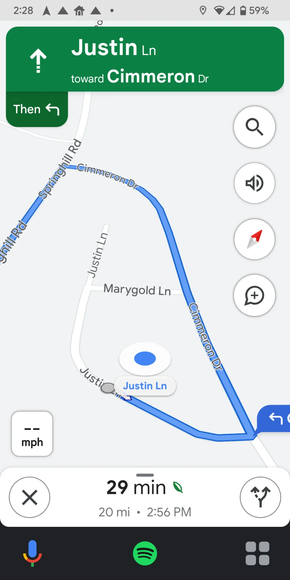
Other changes in the directions mode include audible directions and a big green arrow along our route. These are also addressing the new mental model while driving. They drastically improve our ability to navigate while driving by either making seeing our direction on the screen easy to interpret at a glance, or in the case of audible alerts negating the need to look at our device entirely.
Mental Model #10: Writing a Document
As a designer, writing a document may seem straightforward. However, think about all the different types of "documents" there are, then also think about all the different roles that may write a document.
A few document types to consider:
- Blog post
- Article
- Book
- News
- Financial statement
- Marketing copy
- RCA - Root Cause Analysis
- Legal Contract
- Proposal
- Heuristic Usability Analysis
- Usability Report
Some role types that could be involved in writing a document:
- Copy Editor
- Student
- UX Content Strategist
- Marketer
- Social Marketer
- Researcher
- Auditor
- UX Engineer
- Freelancer
Do you think the mental model for the people writing the above example documents would be the same? No, some may be similar, but many would have a different background, experience with writing, length of time for writing projects, and goals for their writing task.
Freelance engineer writing a contract:
- The mental model isn't just for an engineer, it's for a business owner performing a required but residual task to their business.
- They may not have much experience writing contracts but may need similar documents multiple times.
- Contracts for freelancers are often done during negotiating and are one of the worse parts of the process.
- Contract writing is often stressful and under a time constraint, for a business owner.
- The mental models a freelancer develops for this process are much different than for a lawyer.
As a UX Designer, you will need to account for differences in specific users and their contexts to develop more accurate mental models. This in turn will help create more informed designs that solve problems for the user instead of creating problems.
Summary
Mental models are an important part of user interface design. They allow users to understand how things work by giving them a mental model that they can follow for each task. This article has given you 10 examples of mental models in UX, including what makes it a mental model and why the model is necessary for successful UI design. Whether you're designing your own website or app or working with someone else on their project, these tips should be helpful when considering how to make your product easy to use by all types of people who may need it.
Taxonomy:
ux maps
