Organizing UX with Affinity Diagrams
As a UX designer or user researcher, you know that it's important to keep track of user insights. After all, user insights are the key to creating great design solutions. User insights come from many different sources, numerous qualitative research methods, support tickets, customer feedback, marketing surveys are some examples. Even a small research effort will generate a lot of potential insights. But what do you do when you have a lot of user insights? How do you keep track of them all?
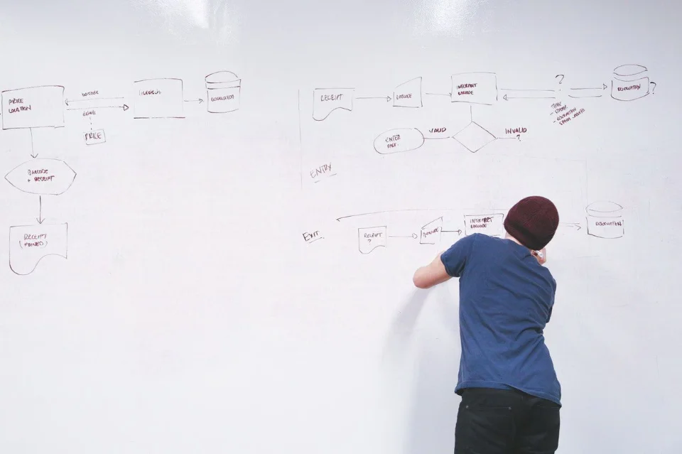
Wes Hunt

As a UX designer or user researcher, you know that it's important to keep track of user insights. After all, user insights are the key to creating great design solutions. User insights come from many different sources, numerous qualitative research methods, support tickets, customer feedback, marketing surveys are some examples. Even a small research effort will generate a lot of potential insights. But what do you do when you have a lot of user insights? How do you keep track of them all?
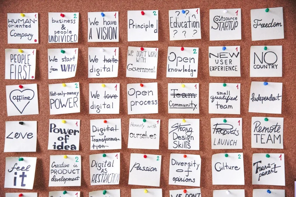
Affinity diagrams are an excellent method to organize user research and UX data. Also known as Affinity maps, they help you see connections in user insights from UX research, organize ideas from UX design, and identify issues that affect multiple areas. Affinity diagrams are especially helpful for identifying areas where you are missing information, or the scope of issues that need to be addressed. With product development and product owners involved, affinity diagrams can help build a shared understanding of problems and solutions in your team and organization.
What Are Affinity Diagrams and the Benefits for UX Research and Design
Affinity diagrams have a few names: affinity mapping, affinity diagramming, collaborative sorting, snowballing, and outside of UX are even referred to as card sorting. Affinity mapping can be done with an open card sort, but card sorting for UX involves other methods as well that are not affinity mapping. In effect affinity diagramming is a subset of card sorting when thinking of UX methods.
Affinity diagrams are a design thinking method that groups observations and insights from user research, ideas during the creative phase or UX strategy sessions. The affinity map allows you to use your experience with creativity while keeping it relevant for stakeholders who can contribute their own opinions about what they see in the research. These maps make large amounts of data more meaningful by starting out as an amorphous mass but collaboratively clustering into topics and subtopics which will result in greater stakeholder engagement than if individual researchers were presenting individual reports.
Affinity diagramming is a powerful tool for individuals or teams to find relationships in large and complex data sets. For UX specifically:
- Qualitative research which generates large amounts of content and insights, affinity maps speed up organization, as well as getting thoughts from other team members. Finding research participant mental models and relationships across qualitative methods such as:
- Usability testing
- Surveys
- Observational Studies
- Ethnography
- Diary studies
- Customer insights sources like support tickets, customer service chats, interviews, feedback surveys, and market research sessions.
- Design sessions, organizing and prioritizing design and brainstorming ideas from design thinking meetings, design sprints, and other sources that generate a lot of ideas.
- UX design, the insights from affinity mapping will aid in creating other important assets like Personas.
- Product strategy sessions, organizing ideas about product strategy and vision. If your organization has a robust discovery process, affinity mapping helps group related discoveries as well as prioritize them to inform product strategy.
Many research projects require a significant amount of input from a variety of stakeholders. In order to ensure that everyone is on the same page, affinity diagrams can be used to build a shared understanding around research insights. This tool allows various team members to quickly identify patterns and similarities in data, which can then be used to generate hypotheses and solve problems. The discussion around how topics are related and grouped together during mapping sessions encourages mutual understanding and will highlight assumptions.
Affinity diagrams help identify areas where you are missing information, and the scope of issues that needs to be addressed. You may need to do further research in order to fill-in any gaps with data or details before proceeding forward. Affinity Diagrams can also show how particular pieces belong together because they share commonalities such as effects on other modules within your system - which means if one area is compromised then there's likely going to be problems across multiple sections!
An affinity map keeps a summary of where insights came from, and can be referenced to from implementation work to show that work is based on real user insights and not merely assumptions. A key goal of any UX work is to reduce assumptions from the product design process. Most product design and strategy in any industry starts with assumptions about the user, when the user is considered at all. By providing a summary of evidence for a decision, affinity diagrams highlight research insights showing a decision is not based only on assumptions.
Although some affinity diagramming can start with predefined categories, by not starting with preconceived categories, you enable better innovation around challenges. Grouping is driven by the user research, not preconceived categories of your stakeholders. It is right in the definition of innovate: “make changes in something established, especially by introducing new methods, ideas, or products.” If you are always starting from the perspective of the sales | product | C-suite teams, you will limit your ability to innovate. From my experience of both working within organizations and with clients, affinity mapping sessions along with other design thinking exercises can shift teams from static organizational thinking to greater innovation without needing to call out their weaknesses.
Using Affinity Maps to Understand Users’ Needs and Wants
Affinity maps encourage different patterns of thinking for designers and engineers and helps you and your team to break ingrained assumptions. There’s a certain gravity in how organizations encourage people to think. This is an organizational way of thinking that makes human-centered design challenging. Affinity diagrams start with the user perspective, as well as focuses on the insights or topics at hand. Especially when not using pre-created categories, the research data can drive new relationships and spur innovation. This in turn spurs discussion around the user perspective, instead of the organization perspective.
As product teams we will still use our experience to categorize the topics. Where the affinity map helps us refocus on actual user needs is we are only working with insights from users. We may not be able to fit their feedback into our existing conceptual models.
An example: Working on an Android application design and being an Android power user myself, we were relying on the OS level notification tray at the top of the UI for important notifications. During research I encountered multiple instances of users ignoring the notification icons and not associating “application alerts” with the full notification tray at the top of their phone’s UI. Putting this and related insights into an affinity mapping session that involved both our CTO and phone application engineers forced everyone to see that the user mental model around notifications didn’t fit with our organizational one built from Google’s Android guidelines. This wasn’t unique to Android, we found similar issues following Apple’s feature sets as well.

Steps for Creating an Affinity Diagram for UX
There are three general steps to creating an affinity diagram for any data: 1) collecting data, 2) sorting data, and 3) generating themes. Let's take a closer look at the steps within these stages for UX specifically.
- Prepare the UX data
- Take all of your encoded research insights and place each onto a “card”. Insights should be specific and actionable, like “Users don’t understand X” or “Password resets increased X%”
- During some research, like usability testing, have observers write down insights and ideas to cards then.
- For ideation, brainstorming, and discovery sessions, have participants write their ideas down on cards.
- Cards can be physical or virtual, I recommend virtual, even if it's a Google Sheet so they are easy to locate later. You can always write or print them out later for in-person diagramming sessions.
- Gather your diagramming team. This exercise works best with people from multiple disciplines and roles. However, it also works well as a solo exercise or just with a single team. For ideation sessions, you can even do this with users or customers.
- Define the goals and objectives of the affinity diagramming session.
- Organize ideas into groups based on similarity. Group similar insights together. Don't worry about putting them in perfect order; the goal is just to get them grouped together so that you can see common themes emerging.
- Sort the data into groups based on commonalities. For example, if you're looking at survey responses, you might group together all of the responses that mention a particular pain point.
- Discuss with your group and draw relationships between ideas within each group. Once you have groups of similar insights, give each group a name that summarizes the main theme. For example, "usability issues" or "navigation problems."
- Take a step back and look at your affinity diagram as a whole. What common themes do you see emerging? Are there any areas where you are missing information? Are there any commonalities among the groups?
- Refine the groupings and relationships as needed.
- Use your affinity diagram to create a plan of action. What problems need to be solved first? What further research needs to be done? Who needs to be involved in solving each problem? What is the scope of the issues that need to be addressed?
- VERY IMPORTANT! Save your diagram! Take photos if you’re using a wall, save the Miro as PDF, export to a Google Sheet, etc. If a physical diagram, you may want to put the groupings into a Sheet so you can refer to specific groupings and insights from your project management tools later, for example Jira.
Getting the Most Out of Your Affinity Diagrams for UX
An affinity diagram is a powerful tool that can help you organize and summarize large amounts of data or complex data for other UX deliverables, like personas, journey maps, and empathy maps.
Once you've generated a list of themes from your user research, it's time to start supporting user-based solutions in product work. To do this, you'll need to answer the following questions:
- What problems need to be solved first?
- What further research needs to be done?
- Who needs to be involved in solving each problem?
- What is the scope of the issues that need to be addressed?
You can use your affinity diagram as a starting point for answering these questions. For each theme, ask yourself what needs to be done in order to solve the problem. For example, if one of your themes is "lack of clarity around product features," you might want to consider conducting usability testing to gather more data about how users interact with your product.
Once you've identified the specific problems that need to be solved from the user perspective, you can start creating your plan of action. Make sure to involve relevant stakeholders in this process, as they'll be instrumental in helping you see your plan through. Perhaps someone from another team can share insights around themes you’re seeing in the affinity diagram. For instance, if you saw “Login Problems” you could talk to Customer Experience to see if that matches what they are hearing from customers.
Shift Product Teams’ Focus From Defect Mentality to Larger UX Improvements
Product teams are often in the mindset of defect fixing when working with an existing product, because defects like a bug in code can be identified by a single customer this gets us into addressing individual customer needs. This is fine for defects, but not for UX and usability issues. An individual report that is UX related is evidence of a potential issue, but it is not an issue to be fixed. Multiple evidence is needed to identify a usability theme or pattern that needs to be addressed. Imagine if you change the workflow of your login workflow every time a single user complained about a single aspect of it? How would that affect your other users? However, if there is a pattern of increased password reset requests to customer service, that indicates a problem to be addressed for many users.
The amount of evidence needed depends on how it is being gathered. Customer feedback is great, but heavily skewed towards people with problems. 99% of your users may love a feature as-is that the 1% are complaining about. Active research with few, but carefully selected participants is more reliable than a larger number of support tickets. In relation to affinity diagrams, these UX maps are great for combining different sources of information for our evidence. Something may not seem significant in one source, but when discovered in a theme with other sources, may indicate a challenge to be solved.
By grouping customer feedback and research into larger themes, affinity diagrams help the product team to get into the UX mindset of addressing broader challenges instead of individual issues. When we are confronted by a single user’s issue, we often want to fix that one thing. As a product team we need to think about all users, and not “fix” one-off usability complaints. If a theme arises around the issue, especially if it appears across customer feedback and active research, then it should be addressed. Otherwise you may hurt other users’ experience by “in the weeds” thinking. I’ve seen this “in the weeds” thinking at many organizations and in every project management style derail innovation and prevent delivering great solutions to customers over the decades.
Key Points for Effective Affinity Mapping in UX
Do not pre-create categories for the exercise (a priori). This defeats the purpose of affinity mapping, you won’t build “affinity” or innovate if you start from biased categories. Similar to card sorting, affinity mapping helps you understand research participants' mental models by how they interrelate topics. Pre-creating topics will bias you towards grouping topics you are already biased towards. Unless you have a very specific reason for using pre-existing categories, don’t do it.
Affinity mapping exercises are very flexible tools, they work for individuals, for just one team, for a multi-disciplinary group, or even with a customer group. The affinity mapping exercise works well with people from multiple disciplines, anyone can recognize patterns and the more backgrounds the more diverse patterns can be identified. Run sessions solo a few times to get comfortable with the method.
Use the exercise as a tool to improve buy-in for further research, UX and solutions from the exercise by inviting stakeholders. Including stakeholders will spread the use of design thinking and human centered design across your organization. Having product development and product owners involved, it can build a shared understanding for both the problems and solutions. Make sure to involve stakeholders in the process. Stakeholder input is critical for understanding the business goals that need to be met and determining which user needs are most important to address. Without buy-in from key decision-makers, it will be difficult to implement changes based on your affinity diagram results.
Conclusion
Affinity diagrams are a great way to organize UX and user research. By grouping user insights into larger themes, they help keep the focus on broader problem/solutions rather than getting bogged down in details. And because they involve people from multiple disciplines, they can help create buy-in for both further UX work and solutions from the exercise itself. If you're looking for a way to organize your UX and user research, give affinity diagrams a try!
Taxonomy:
ux maps